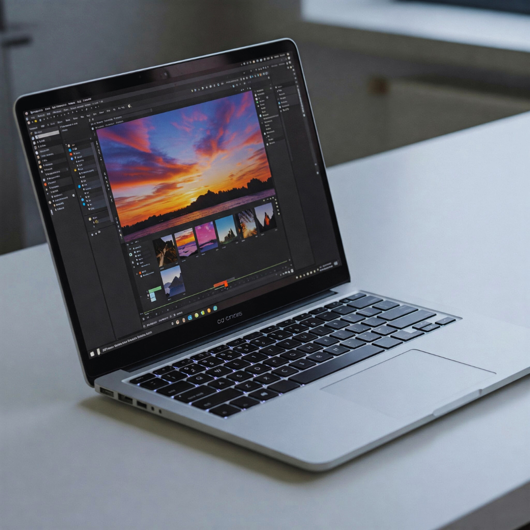
Creating a consistent aesthetic for blog visuals is vital to establishing a clear and recognisable brand identity. It involves applying the same colour schemes, fonts, and design elements across all content, ensuring a cohesive look that resonates with the audience. A consistent visual style helps blogs stand out, makes the content easier to navigate, and strengthens the connection between the blog and its readers.
Maintaining this consistency requires deliberate choices in design, such as using signature icons or custom graphics that reflect the blog’s personality. Keeping a simple layout with ample white space and bold typography also contributes to readability and visual appeal, making the blog both polished and inviting.
By aligning all visual elements under a unified style, blogs can create a professional and memorable experience. This not only improves brand recognition but also builds trust and encourages visitors to engage with the content more deeply.
Understanding the Importance of Visual Consistency
Consistent visuals create a unified and recognisable look that strengthens a blog’s presence. This approach supports the brand’s identity, shapes how the audience perceives the content, and aids in making the blog easier to read and more engaging.
Brand Identity Reinforcement
Visual consistency reinforces a blog’s brand identity by repeating key design elements such as colour palettes, typography, and image styles. These elements act as visual cues that help the audience immediately recognise the blog across different platforms.
By maintaining uniformity in visuals, the blog projects professionalism and credibility. This consistent presentation builds a strong visual memory, making the brand more memorable and distinct from competitors.
A clear and steady visual language ensures that every image, graphic, or layout reflects the blog’s core values and tone. This alignment ties all content together under a cohesive identity.
Audience Perception and Trust
When a blog maintains visual consistency, it signals reliability and attention to detail. Readers are more likely to trust content that appears polished and thoughtfully curated.
Inconsistent visuals can create confusion or suggest a lack of professionalism. On the other hand, a consistent aesthetic reassures the audience that the creator is dependable and committed to quality.
Trust grows as readers recognise the blog’s style and feel more comfortable returning for future content. This emotional connection is key to fostering long-term engagement.
Improving Readability and Engagement
Consistent visual choices such as typography, colours, and spacing improve the readability of blog visuals. Clear and predictable design helps users focus on the message without distraction.
A structured aesthetic guides the eye smoothly through images and text, increasing the likelihood that readers will engage with the content. Well-organised layouts promote better comprehension.
Visual uniformity also streamlines the content creation process, allowing for quicker production of fresh visuals that fit the established style. This efficiency supports regular posting and sustained reader interest.
Defining Your Blog’s Visual Style
A clear visual style guides every design decision, ensuring a coherent look and feel throughout a blog. It involves selecting specific visual components that align with the blog’s purpose and audience. Details such as colour choices, typography, and consistent imagery shape the overall aesthetic and influence user experience.
Establishing Core Visual Elements
Core visual elements form the foundation of a blog’s identity. This includes logo placement, image style, iconography, and graphical motifs. Consistent use of these elements across posts helps cultivate brand recognition.
Images should maintain a unified style—whether photography, illustrations, or graphics—and adhere to a consistent tone, such as minimalist or vibrant. Icons and buttons require uniform shapes and line weights to avoid visual distraction. Spacing and composition rules also contribute to a polished, professional appearance.
Selecting a Colour Palette
A focused colour palette enhances visual harmony and reinforces the blog’s personality. Typically, it includes a primary colour used for dominant features like headers, navigation, and calls to action.
Supporting colours include secondary and accent colours that provide contrast and variety without overwhelming the primary tone. These should complement one another and remain consistent across backgrounds, text highlights, and graphic elements.
Choosing colours that reflect the blog’s theme or emotional intent improves the audience’s connection and recall. Limiting the palette to three to five colours maintains clarity and avoids visual clutter.
Choosing Typography and Font Pairings
Typography impacts readability and mood. Selecting one or two primary fonts establishes consistency and professionalism. Generally, one font serves for headings while another complements body text.
The fonts must harmonise in style—such as pairing a serif with a sans-serif—and maintain legibility across devices. Weight variations like bold or italic can emphasise key points without adding new fonts.
Line spacing, letter spacing, and font size should follow a hierarchy to guide readers smoothly through content. Typography choices should align with the blog’s tone, whether formal, friendly, or modern.
Creating Visual Guidelines and Templates
Clear visual guidelines and reusable templates are essential for consistent blog aesthetics. These ensure each image aligns with the brand identity while simplifying the creative process. Establishing precise rules for template design, image sizing, and iconography style helps maintain uniformity throughout all blog visuals.
Designing Image Templates
Image templates standardise the look of recurring visual elements such as featured images, headers, and social media posts. Templates should include fixed zones for text placement, logo positioning, and visual hierarchy to preserve clarity and brand recognition.
Tools like Canva or Figma allow easy creation and editing of templates. Including brand colours, fonts, and specific filters in the template ensures every visual fits within the brand’s style.
Consistency in templates reduces design time and prevents deviations from brand standards. Templates can be adapted for various content types, but should retain core visual elements to maintain coherence.
Standardising Image Sizes and Formats
Setting standard image dimensions across blog posts creates a balanced appearance and optimises loading speeds. Common sizes include 1200×628 pixels for social media previews and 800×450 pixels for blog headers.
Uniform file formats like JPEG or PNG ensure compatibility and maintain quality. JPEG is suitable for photos due to its smaller file size, while PNG is preferred for graphics needing transparency.
Consistent aspect ratios help avoid distorted images on different devices. Defining these sizes in guidelines improves efficiency and ensures seamless visual integration across platforms.
Developing Iconography Styles
A consistent icon style strengthens the blog’s visual identity by providing recognisable visual cues. The style can be minimalist, flat, outline, or filled, depending on the brand’s personality.
Icons should use a restricted colour palette aligned with the brand’s colours. Line thickness, corner radii, and size must be standardised to create harmony across different icons.
Maintaining a dedicated icon library and including usage rules in the guidelines supports consistent application and simplifies updates or additions. This approach keeps iconography cohesive and professional.
Maintaining Consistency Across Visual Assets
Consistency in blog visuals depends on uniform editing styles, recurring graphic components, and harmony between photography and illustrations. Clear rules must be established and applied to maintain a cohesive and recognisable aesthetic.
Using Consistent Editing Techniques
Consistent editing ensures that all images share a uniform look, reinforcing brand identity. This includes applying the same filters, colour grading, contrast levels, and sharpness across photos and graphic elements.
A clear editing workflow should be documented and accessible, using tools like Lightroom presets or Photoshop actions. Saving these settings as templates allows efficient replication across multiple visuals.
Maintaining the same aspect ratios and resolutions is also critical to avoid jarring differences between images. This approach provides a polished and professional look throughout the blog.
Applying Reusable Graphic Elements
Reusable elements such as borders, icons, and typographic styles strengthen visual continuity. Creating a set of standard templates or graphic assets helps keep these elements consistent across posts.
Storing these components in a shared library or using design platforms like Canva ensures easy access and adherence to brand guidelines. Utilising pre-defined colour palettes and fonts in all graphics prevents disjointed appearances.
Regularly reviewing and updating these assets helps maintain relevance while preserving the original aesthetic principles established for the blog.
Photography and Illustration Alignment
Visual harmony requires photography and illustrations to complement each other stylistically. Choosing images and drawings with similar tones, colour schemes, or moods avoids clashing visuals.
Illustrations should follow the same colour palette and line style consistently. Photographs should be edited to match the blog’s overall lighting and saturation profile.
Coordinated visual elements enhance user experience by making content look intentional and well-curated, strengthening the blog’s overall identity.
Selecting Tools and Resources for Visual Creation
Choosing the right tools and resources is essential to maintain a consistent aesthetic in blog visuals. The selection influences quality, workflow efficiency, and the ability to align graphics with the blog’s visual identity. Key considerations include software capabilities and how to source images that complement the design style.
Graphic Design Software Recommendations
Professional-grade and user-friendly software serve different needs in visual creation. Adobe Creative Suite remains the industry standard for detailed and customised graphic work, offering tools like Photoshop and Illustrator for image editing and vector design.
For those requiring simpler or more template-based designs, Canva provides an accessible platform with drag-and-drop features and a wide range of preset styles. Figma is useful for collaborative projects due to its cloud-based interface, allowing multiple users to design in real-time.
When selecting software, compatibility with file formats, the availability of design assets, and ease of integrating brand guidelines into projects should be priorities. Software with built-in templates and consistent export settings aids in preserving the blog’s visual identity across posts.
Utilising Stock Photography Effectively
Stock images can enhance blog visuals, but must be used strategically to avoid generic or inconsistent appearances. Choosing images that reflect the blog’s colour palette and overall tone strengthens visual cohesion.
Free and premium stock photo sites like Unsplash and Shutterstock offer vast libraries, but selection criteria should focus on image style, composition, and relevance to the blog’s content. Customising stock images with overlays, filters, or cropping helps personalise them and maintain alignment with the blog’s aesthetic.
Organising stock photos into a dedicated folder or library based on topics or themes ensures quick access and consistent use. Regularly updating this collection supports fresh and cohesive visual storytelling while reducing the risk of repetitiveness.
Implementing Consistency in Collaborative Workflows
Maintaining a uniform visual style requires clear communication and organised resources across the team. Standardised procedures and easy access to approved materials ensure everyone follows the same guidelines and uses consistent design elements.
Sharing Guidelines with Team Members
Clear, accessible guidelines are essential to keep the team aligned on the blog’s visual aesthetic. These guidelines should specify typography, colour palettes, image styles, and layout rules.
Using a central document or platform, such as a shared drive or a style guide portal, helps all members refer to the same standards instantly.
Regular updates and feedback sessions reinforce adherence and address any inconsistencies. Assigning responsibility for guideline maintenance ensures they stay relevant with evolving design needs.
Structured training or onboarding materials can assist new contributors to quickly understand and apply the visual rules, reducing errors and maintaining quality.
Managing Asset Libraries
Centralised asset libraries improve control over visual components like logos, icons, photos, and template files. These libraries should be organised clearly, with folders categorised by type, usage permissions, or project.
Version control is crucial to avoid outdated or incorrect materials. Teams benefit from digital tools that track changes and enable easy restoration of previous asset versions.
Naming conventions and metadata tagging aid in quick asset retrieval and consistent use. Clear instructions about which assets suit particular content types prevent off-brand visuals.
Regular audits of the library are necessary to remove redundant files and incorporate fresh, approved materials. This practice keeps the visual inventory relevant and efficient for collaborative use.
Monitoring and Refining Your Aesthetic
A consistent aesthetic requires ongoing attention to how visuals perform and resonate with the audience. This involves gathering feedback, tracking key metrics, and continuously adjusting visual elements to maintain relevance and cohesion.
Assessing Performance and Audience Feedback
Effective monitoring begins with evaluating how blog visuals engage and impact the readers. Metrics such as click-through rates, time spent on page, and social shares provide insight into which designs attract attention and encourage interaction.
Audience feedback, collected through surveys, comments, or social media, reveals preferences and perceptions. It helps identify what visual elements work well and which may need adjustment.
Combining quantitative data with qualitative insights ensures a balanced view of performance. This approach enables clear decisions about whether the aesthetic aligns with the brand’s message and audience expectations.
Iterating and Evolving Visual Elements
Visual aesthetics should adapt thoughtfully over time without losing their core identity. Iteration involves refining colours, typography, composition, and image styles based on feedback and performance data.
Small changes like adjusting colour tones or updating fonts can refresh the aesthetic while preserving brand recognition. Introducing new visual motifs or textures can enhance appeal, but must be consistent with the established style guide.
Regularly reviewing and updating a mood board or style guide helps maintain direction. This documentation guides future design choices and ensures that any evolution supports overall visual coherence.